Can the design of a stone affect the colour as a camera sees it?

Prospecting Australia

Help Support Prospecting Australia:

This site may earn a commission from merchant affiliate links, including eBay, Amazon, and others.
Joined
May 1, 2014
Messages
1,958
Reaction score
2,530
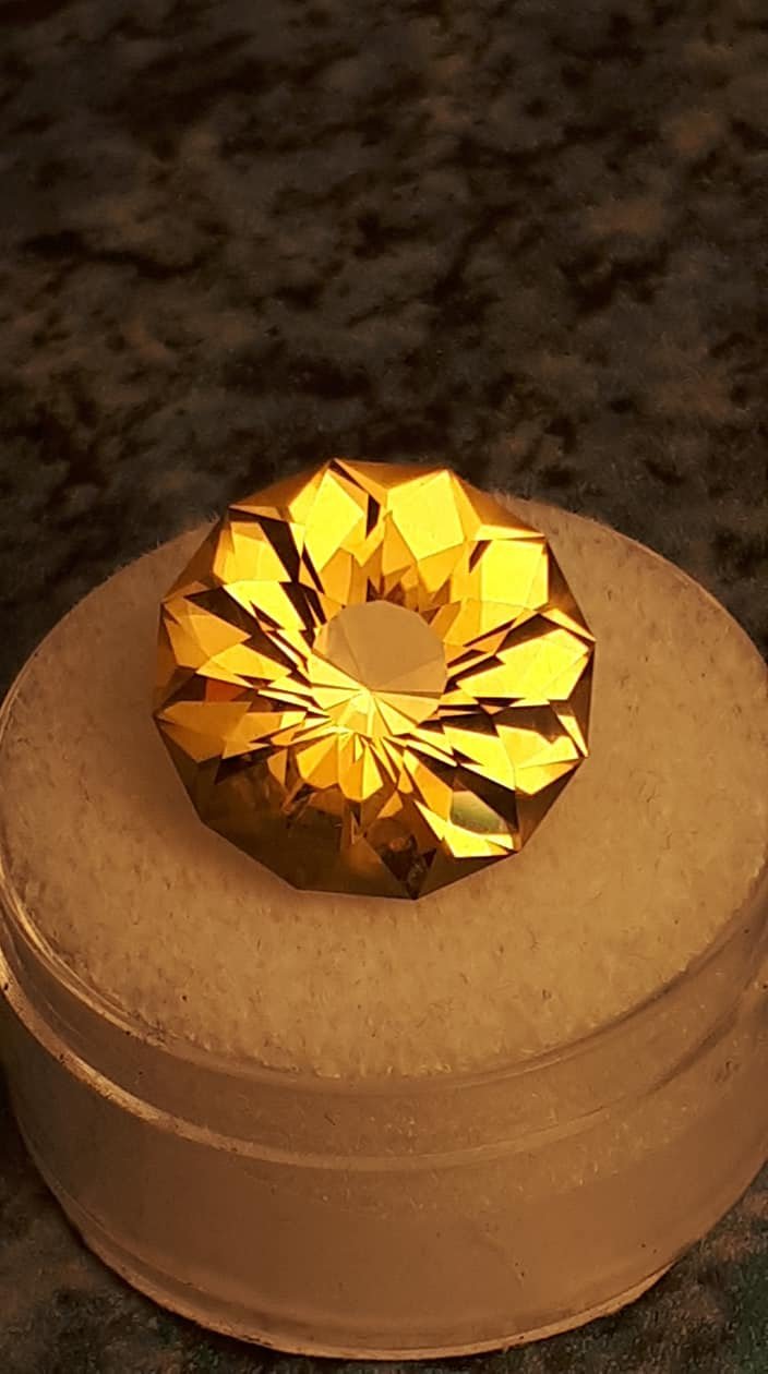
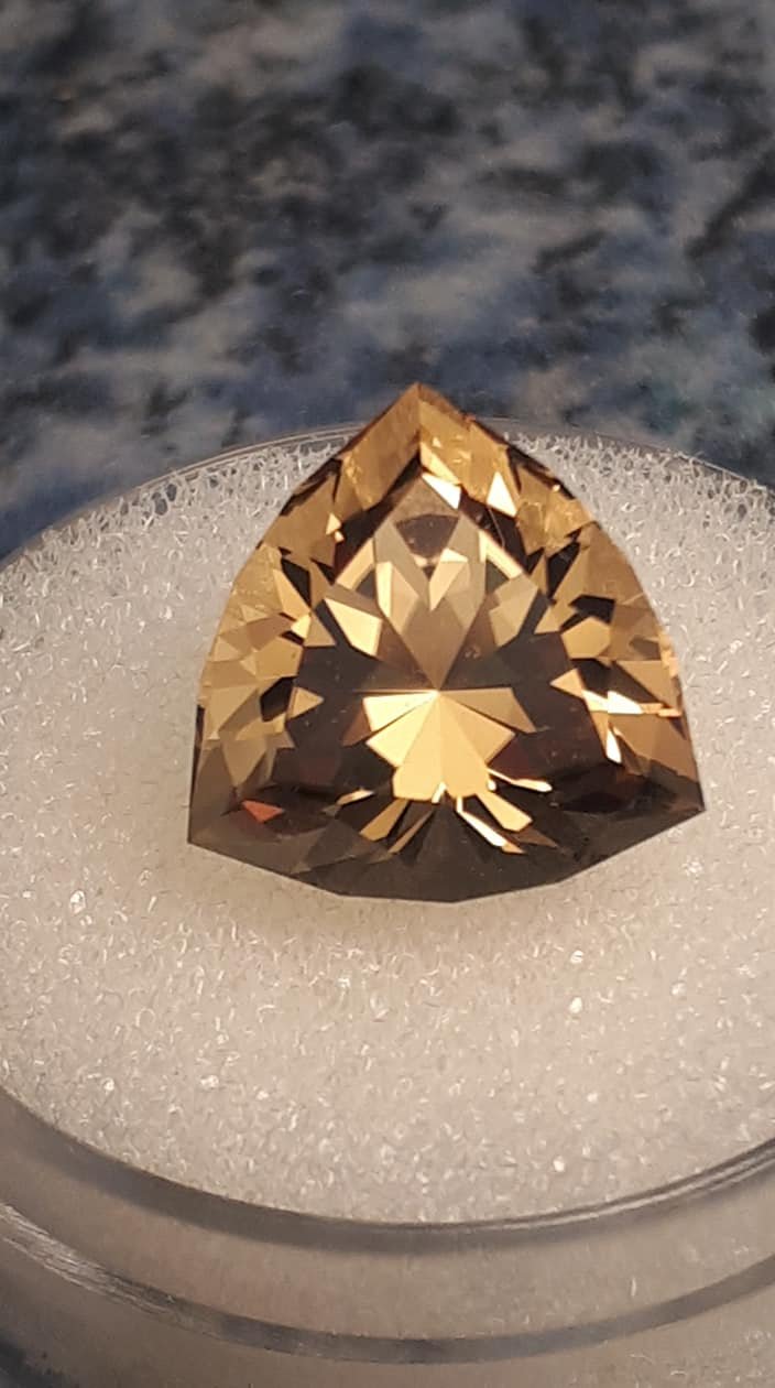
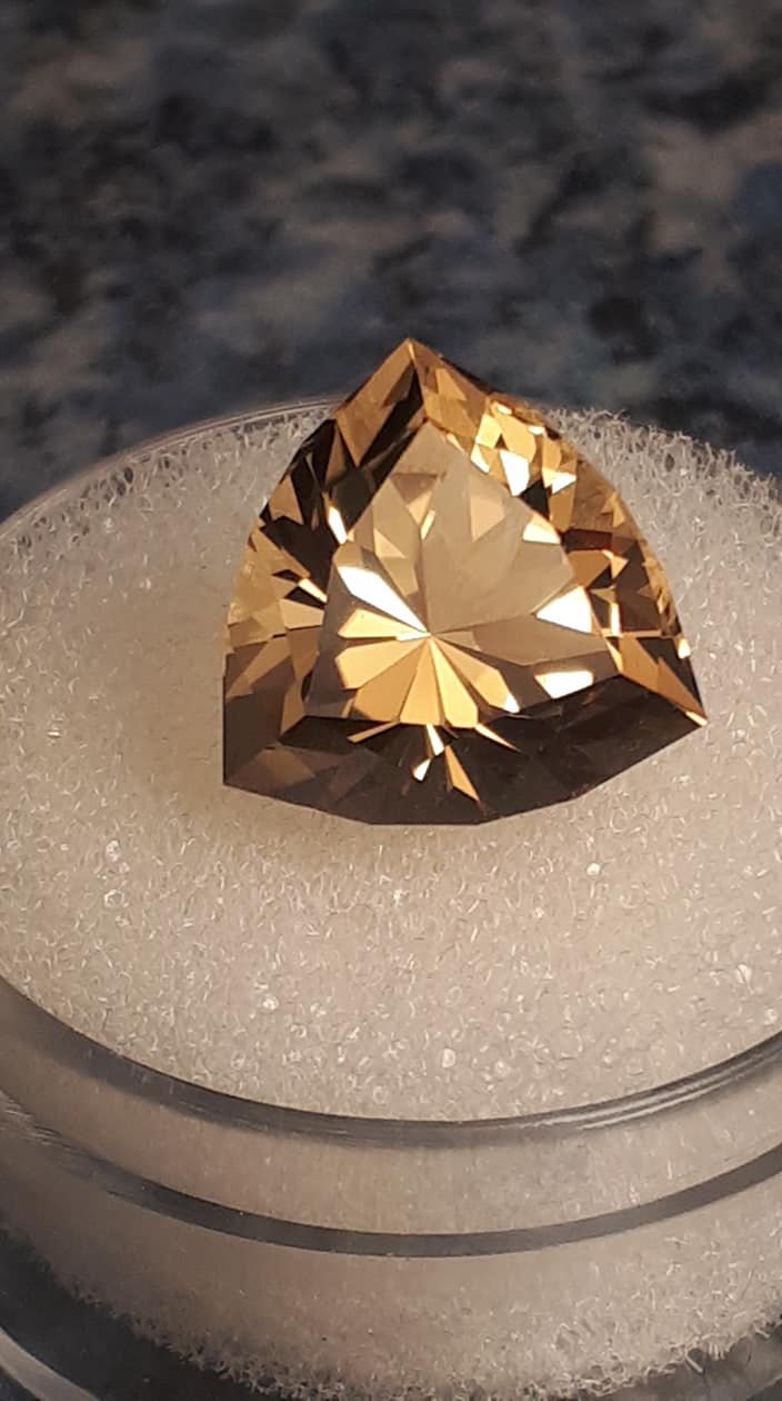
Seriously wondering if this can be the case? Here's two stones I cut from the same piece of citrine rough. Place them side by side and the colour is identical as seen by the eye - as expected since they are "twins" from out of the same large rough stone. However, the camera has other ideas, despite all the photographing conditions being the same. With the round stone, the camera played nice and showed the colour exactly as the eye sees it. However, with the triangle/shield, the camera decided to see it as having a slightly brownish or "ginger beer" tint to it, which it does not. I can't photograph the two together since the first one went to a new home just after the second one was completed.

1532810415_37332312_10155676498795959_2025134654100602880_o.jpg


And two photos of the above stone's twin brother....

1532810524_37876168_10155700640670959_554895841769291776_o.jpg


1532810465_37878867_10155700640710959_7308348649027665920_o.jpg


Since the camera tends not to perceive things exactly as the human eye does, is it possible that the way different designs reflect light differently within them may affect how the camera picks that light up?
 
Ok, seeing the pics side by side for the first time I can see the background tone of the first is darker - with no attempt by myself to make it that way.

But which kind of gives the impression that I have attempted to fiddle the colour of my stones, which I would never do under any circumstances - honesty is paramount for a gem cutter.

Jeez I hate trying to photograph stones!! :( :( :( :( :( :( :( :(
 
Hi Lefty. Its all down to White Balance.

The camera tries to correct the image colour balance to make white components of the image look white under different conditions. However this usually requires manual calibration or post editing compensation as the camera algorithm for picking a white reference in the image is seldom accurate. Best results are with a flash but that wont work for you in macro mode...

Use a consistent background with a white spot to use as a reference. Look in the camera's settings for white balance options. Play with settings and see if you can get the white reference spot to look white consistently. If in doubt GOOGLE white balance.
 
Cheers for that Gizmo :Y:

I keep thinking about lashing out on a camera with a macro lens but then the phone camera suddenly decides it's going to take nice photos - until the next one.

Strange thing is while the background looks yellowish in the first photo, it also accurately represents the stone as it's true bright yellow - which the stone looks to the eye pretty much regardless of the type of lighting. Incandescent, fluro, natural light - the stone is bright yellow in all of them when seen with the naked eye.

By contrast, the background lighting in the following photos looks more natural but the camera sees the stone as being ginger beer-coloured when it is the exact same bright yellow to the eye in any lighting.

I cut this stone a while ago but have hesitated to offer it for sale because the camera sees it as a "pile or dome of facets with a flower on top" - that's not how it actually is. It's a normal-shaped stone with a flower motif inscribed in the bottom.

Anyway, thanks for that info mate, I'll just have to keep playing around and persisting.

Cheers
 
The background colour on the container is the giveaway as to what is going on, some of this effect can be fiddled with using the brightness setting prior to taking the photo on the iPad camera and colour tones can be fiddled with afterwards assume the phone has the same control. I am with you though, a good shot showing what the eye can see is the bottom line for integrity.

Have you tried locking on the white container to capture true colour then moving it forward to make the stone match the locked focal length?

Ultimately I think you share the same frustration as me Lefty - to invest in a decent camera and learn how to use it properly, or persist with what you have and try to make the best of it.

Having seen some of Barneys stones on his Facebook page, I know the answer is throw another grand on the table........but :rolleyes: .....as I like hammering my head at a brick wall sometimes, maybe one more crack at mastering the iPad camera before I admit defeat.. :brokenh:
 
Interesting snippet of info....

The colour of the light will affect the colours in your photographs. You probably won't notice this with the naked eye because our minds adapt very quickly to perceive the colour of the light as neutral, even when it's not.

The camera is less forgiving, and records colours exactly as they are. That's why pictures taken under household lighting have an orange colour cast, and pictures taken at dusk or dawn have a cold, blue look.
https://www.techradar.com/au/how-to...the-color-of-different-types-of-light-1320993

So the brain makes sense of things by making adjustments to how we perceive colours in different types of light, trying to keep what we see consistent - whereas a camera just tends to capture and show the raw image? Makes sense actually.

I guess the colour shift created by different types/wavelengths of light moving through different kinds of transparent material has to be fairly extreme before the brain gives up trying to compensate, such as in materials like the form of chrysoberyl known as Alexandrite, bright red under one type of light and bright green under another. Just like a piece of man-made material I faceted a while ago that showed the same total colour change depending on the type of light - in this case, the camera saw it exactly as the eye sees it.
 
. I am with you though, a good shot showing what the eye can see is the bottom line for integrity.

Absolutely Wally!!

And I think that is where the statement that our eyes are deceiving us while the camera shows the "true" colour may be factual from a scientific point of view but a bit meaningless when applied to real life.

For example, if I show you and 10 other people a stone that everyone agrees looks red, and then I say "no, no - you and I and everyone else are being fooled by our brains, in light of this wavelength the real colour is green"...........well, good luck convincing everyone that a stone that they can see is red is actually green!!

All that matters is that the stone in the photograph is as consistent as possible with what the eye sees first hand. Only issue I see is that in order to achieve the "eye-true" colour, the camera had to perceive the background as being yellowish - which gives the impression that the colour of the photo has been altered to enhance the colour of the stone when this is not the case. Everyone who has seen either or both stones with their own eyes agrees that they are bright yellow.

When the day comes that human beings are all Borg with cameras attached to their eyes and wired to their brains, then the issue will be solved. Until then, the "true" colour of a stone will be what most people perceive it as with their own eyes - not whatever a camera might want to see until adjustments are made.
 
Unfortunately cameras can't even agree on the colour of a stone.

In this link https://www.gemologyonline.com/Forum/phpBB2/viewtopic.php?f=57&t=20191 we can see one camera sees the emeralds as green while the other sees some as red. 8)

I think adjusting the colour using software is quite acceptable as long as you are adjusting to the true colour the eye sees

Also the camera mentioned in the link may be worth checking out as a cheap option to a macro set up. :/

[video=480,360]https://youtu.be/xI--gZyl0rI[/video]

They do make jewelry specific models also but the price is up there.

[video=480,360]https://youtu.be/0TYj_pMMQ68[/video]
 
Cheers for that info there MM :Y: It's been such a thorn in my side ever since I started faceting. For years it wasn't all that important so I let it slide but it really is important now.

I'm happy for the most part with the improving quality of the photos overall, but true colour representation has been a sticking point. As stated earlier, as far as I'm concerned, the "true" colour of a stone can only be what the human eye sees and I feel I have to do whatever I can to get an accurate representation.
 
Gizmo and Wally69 are in principal spot on, unless you lock the colour balance of the environment and maybe the settings in the camera/phone, you will get a variation. This is not only influenced by the background but more importantly by the light source.

Daylight is generally considered to be 5600K (degrees Kelvin) but can vary, bright sunlight can be up to 9000K, LED can be either 6000K, 4000K or around 2800K often referred to as Daylight or Cool White, White and Warm White, tragically there is no standardised description between manufacturers, halogens and incandescents are all around 3200K. Fluoro lights are a world of their own and can often throw a green colour cast in pictures.

If you phone is set for indoors, the internal (software) preset is around 3200K so if the stone is in daylight it will hold a very blue colour cast, if the phone/camera is set for daylight and the stone is indoors under artificial light then the stone may have a very warm colour cast, depending on the type of light source. You can correct the colour casts in photo editing software, but they are rarely as good as a natural photo taken with the right settings, oh and flash is daylight.

Mate, it's a bit to get your head around, but that's it in a simple nutshell.

I'm used to dealing because I'm an ex cameraman & still photographer.

As you are photographing stones regularly, try and work out a standardised setup for your pics, then a quick play with your phone's settings to find a combination which gives you results you are happy with, it'll be a lot cheaper that a camera and macro lens!
 
Cheers for that Dihusky :Y: Missus didn't sound keen to let me play around with the white balance since its her phone but I'll sneak a go at it when she isn't looking :D
 
Looks like the first pic has a yellow (warm) light the other is a blue (cool) light.

Colour spectrum of the lighting can massively impact on stone colour. I.e. blue topaz photographed under warm or incandescent lighting will appear pale, more whitish. Same stone photographed under cool or day light will appear much bluer.

Its the opposite for your 2 stones. Warm light on a yellow stone makes the colour seem richer than it does under a cool light. I try to photograph under the same light no matter what the stone is. Sometimes its tempting to go for the better shot but for the sake of consistency its best to stay on the path. Only exception is photos out in the sun.
 
Its the opposite for your 2 stones. Warm light on a yellow stone makes the colour seem richer than it does under a cool light. I try to photograph under the same light no matter what the stone is. Sometimes its tempting to go for the better shot but for the sake of consistency its best to stay on the path. Only exception is photos out in the sun.

That was the frustrating thing with that one SC - both stones were photographed under the same lighting conditions and warm light did not make the stone colour seem richer to the eye than it actually is.......warm light was necessary for the camera to be able to see the rich yellow-amber colour that the stone actually is to the naked eye when viewed in pretty much any kind of light :/

But that light created a yellowish tint to the background which gives the impression that the stone is not actually that colour (when it is to the eye), and that I have fiddled with the lighting or filters or something in order to give a misleading impression as to the natural colour.

By contrast, the other stone has a lighting background that looks "natural" - but which makes the same yellow-amber colour of the second stone appear ginger beer coloured in the photo.

But because the background tint looks "more natural", it would be natural for anyone viewing only the photograph to assume that the stone is ginger beer coloured when it is not that colour at all when viewed with the eye.

It felt like the camera was conspiring to bear false witness against me :eek:

No problems at all with the garnet - the colour in the photos is very consistent with what the eye sees. The camera just seemed happy to accurately represent that rich rose red colour, unlike the previous stone.

As Gizmo, Wally and Dihusky have pointed out, I probably just need to practice getting the white balance correct - we must accurately represent our stones in the photos as best as possible.
 
Top